Project Overview
This work was enhancement to an app for a company in the home automation space. The app is what users use to control their smart home. Previously, their home automation products had to be entirely installed and configured by dealers. However, through our customer feedback portal Delighted, we learned that with the increased exposure to DIY home automation platforms, some of our customers were willing to have more control over configuring their smart homes.
Three areas of configuration we wanted to target first were Voice Assistants, Notifications and History.
Responsibility
- User Research
- Wireframing
- Prototyping
Tools
- Delighted.com
- Sketch
Voice Assistant Setup
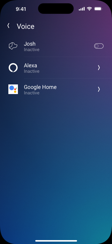
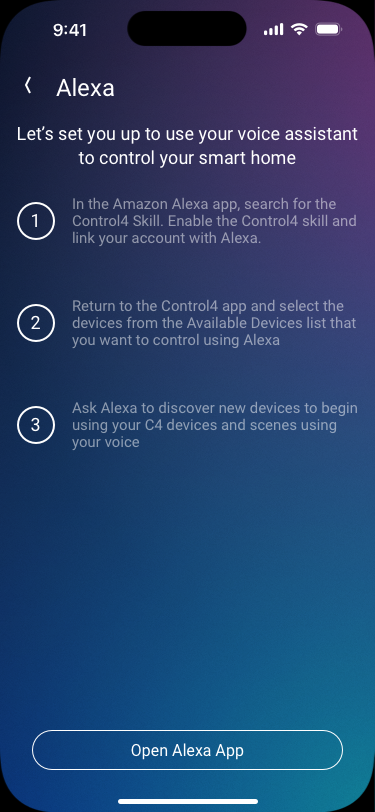
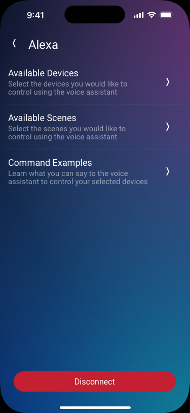
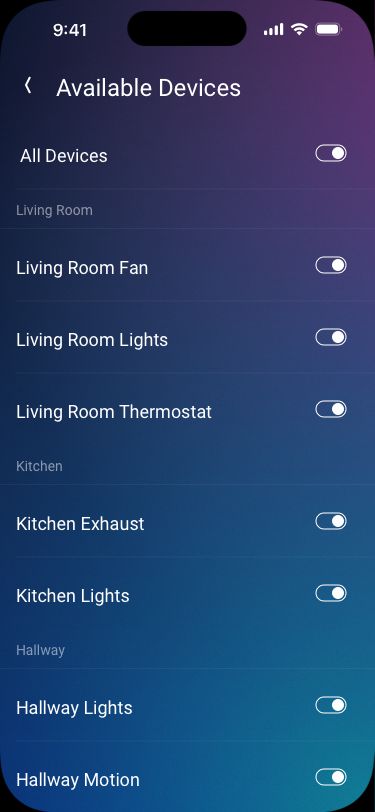
As off the shelf voice assistants in homes become more common, we worked on giving users control over which systems they want linked with the platform. The level of control went beyond just linking the voice assistant in the form of granular control over which devices they wanted to share to the voice assistant. Which meant it was not just an education portion to be considered, but also an information architecture problem.
Users needed to be first coached on the steps they would have to take on the voice assistant's app. Next users would be able to choose to allow all or some of the devices in their home to be controlled.
Design Process
Using the company's design system and component library in Sketch, I started mocking up the flow of the voice assistant setup process. We considered several alternatives for how the available devices across the rooms in the home should be displayed. In the end, we opted to forego submenus for each room and it's devices for a flat list grouped by rooms.
Notifications
A smart home is not very helpful if it doesn't communicate what it senses. But our users don't always want to be notified about everything. We had to make sure the users would be able to turn on and off notifications from different categories of devices and their various events.
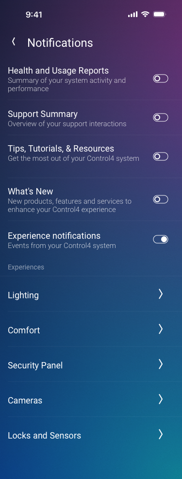
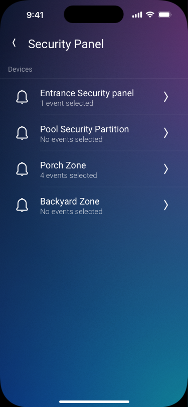
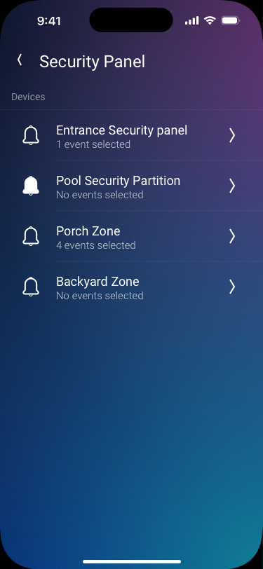
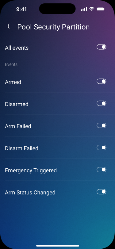
While our first iteration had the events at the top level and then the devices that could produce that event, after much deliberation, we went with the option to have the device name first and then the events generated by that device.
History
The activity the home observes can also be viewed in a history view. Users already have access to the recordings and events. But we wanted to take it further by providing users to turn notifications on or off as well as pinning certain events to the top of the list from the same view.
For both of these actions, instead of adding more menus and buttons, a swipe gesture is used.
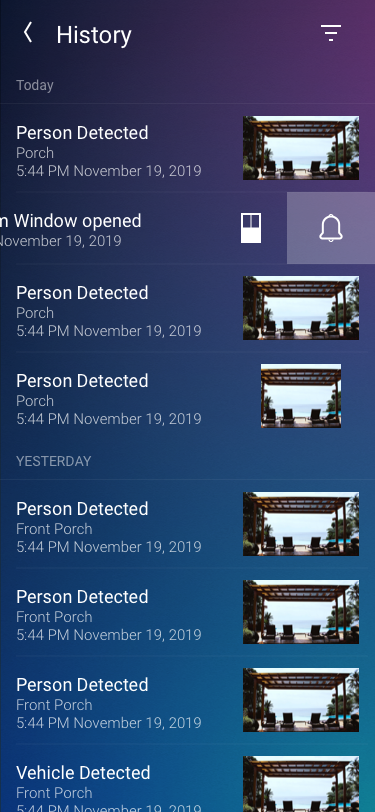
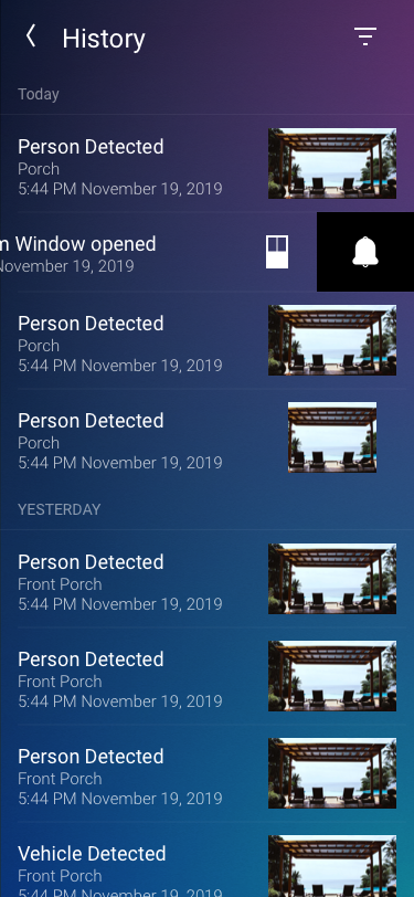
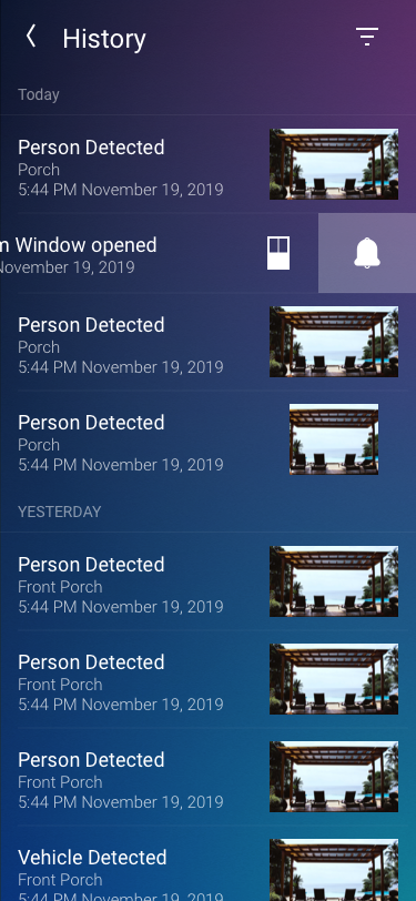
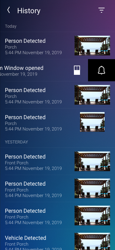
Swiping to the left on a history event will toggle notifications for that type of event from that device.
The mocked up images however, did not fully communicate the experience of pulling the item to the left and seeing the bell change state. A Figma prototype with animation helped clearly communicate what the desired UX was.
Motion design is an essential part of modern UX design
